-
Your shopping cart is empty!
MENU
Your shopping cart is empty!

COLOUR MATCHING in home furnishing is a very profound knowledge. Different colour combinations will exhibit different overall effect.
Perhaps after reading this article, you can become a master of furniture colour matching too!
Tip #1: Match The Colour
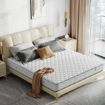
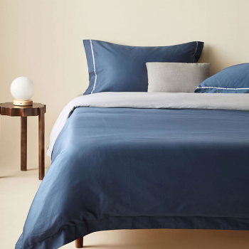
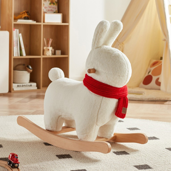
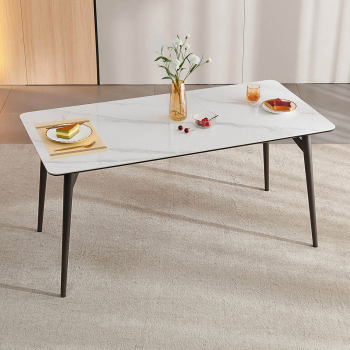
The different shades of the same color gives the space a sense of unity and coordination. This is the most common and easiest method. You can use accessories such as pillows, curtains, bed covers and cushions to embellish your room to create a harmonious and unified room.
Assessory #1 - Pillows
There are countless cute designs and colours for pillows.
How can you tell if which suits your furniture, and which doesn't?
▼
1st step: Think about the colour of the pillow you have at home. Then use that colour as your basis, choose your new pillows with different patterns.

2nd step: No matter which pattern you have on your new pillows, the rule here is for it to have the colour of your basis pillow.

3rd step: You can then choose pillows with more complex patterns and designs, but remember the rule that it must coincide with the colour of your basis pillow.

Can you see it? How the pillow matches with each other even though they look entirely different.
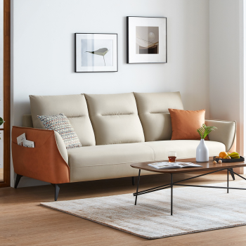
Assessory #2: Wall Painting
Look at the picture below. The colour of the pillow on the right side of the sofa is selected to match the painting.
Then the colour of the other pillows are choosen based on the basis pillows, just like the rule explained above.

Of course you can try it the other way round too!
Matching the painting's colour with the pillows. Either one of the painting and pillow can be used as your basis.
Assessory #3 - Flower Pots
From clock hung on the wall, to the pots on the floor. Anything can be used as your basis to match colours.
Check out how the flower pot matches with the pillow, and the clock with the sofa!

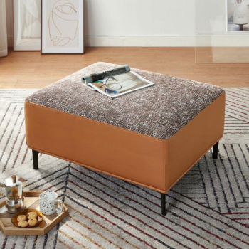
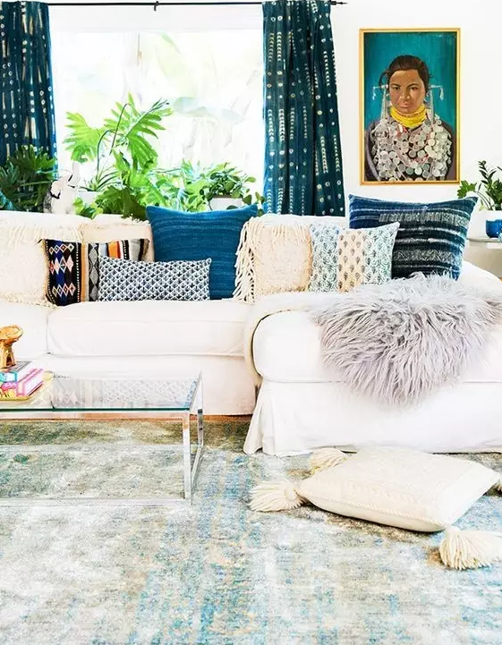
Assessory #4 - Carpet
The table has many colourful little ornaments on it, but the entire picture doesn't seem too chaotic.
Look at the colour of the vases on the table and the colour of the floor carpet.

Now, lets check out another higher-level mashup!
Mixing simple Scandinavian styled sofa with lively Bohemian styled carpet. Totally sound like a bad idea.
By using two Bohemian styled pillows on the sofa, the entire living room blends in like a magic!
Try to imagine if we remove the pillows...

Assessory #5 - Curtains
Curtains are like a softer version of the wall. It covers a large area with its colour.
The colour tone of the entire room is also determined by it.
You'd never go wrong if you match your other assessories with the curtains (no matter how ridiculous your curtain colour is)

Here's another example~
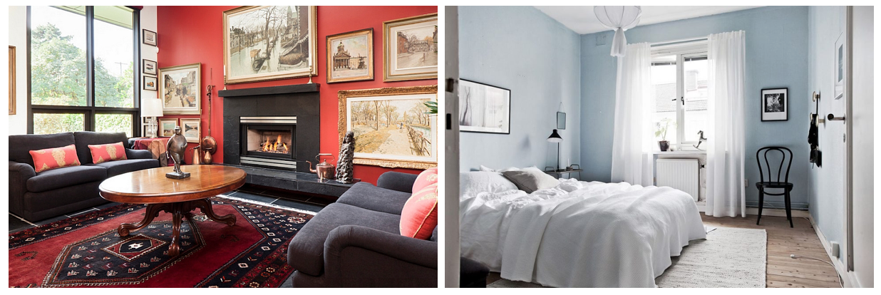
Tip #2: Use Contrasting Colours
In principle, you can use whatever colour for your home furniture matching, as long as it does not exceed 3 colours, then it will not feel cluttered (except for black, white and grey)
.jpg)
When using contrasting colours, it is important to pay attention to the functional requirements of the room. Unless you really like to have it, do not use bold colours in your bedroom. Milder colours help you relax better in your rest area.

By choosing a basis colour, then using it recurringly in different spaces, it creates a sense of overall unity.

Here are some really good colour combinations! Hopefully these will give your some inspiration with colours!
Blue + Pink

Black + White

Green + Neutral Colour

Green + Blue

Tip #just-some-general-helpful-tips...
1. Lights - If your room has ample of sunlight or lightings, then yayy! Paint your wall with deep bold colour. Promise, it will look extremely gorgeous, retro and classy. If your room doesn't have more lights than a cave, then stick to lively, bright coloured walls. White walls are dream too!
2. Colour Tone - Warm colours generally makes the room appear more compact, whereas cool colours makes it look more spacious.
3. Wallpaper - Wallpapers with big patterns tend to make the room look smaller. Opt for bright little floral wallpapers to make the space look wider.

4. Bold Colour - Reserved about using bold colours in large area? Then use it in localised areas. It would look as amazing as well!

5. Functions - Different colour impacts the feel of the room differently. You might want to consider the liking of the occupants of the room when choosing the colours. Your kids would love bright yellow or pink room, but your parents might want a calmer beige coloured room.

Ultimately, colour matching is like falling in love.
Pair them correctly, and they will create chemistry and spark like never before.
--
inspired home living | MUMU Living